No matter what vertical or category your business falls into, referral programs have been proven to work for all types and size companies. But knowing how to do referral programs well is another story.
In this webinar, Friendbuy COO Tony Mariotti draws from his experience of running thousands of referral campaigns. He’s been in the sales and marketing trenches since the ‘dot com’ boom and bust of the late 90s.
Friendbuy is a customer referral platform, where marketers can set up customer referral campaigns and measure performance.
Note: This webinar is geared for people who sell something. When you think about collaboration products like Yammer, invitations are almost vital for the collaboration necessary for the tool. You invite your coworkers and the product is useless without other people using it. If you look at freemium models like Dropbox, they ask users to upgrade and ask cohorts to sign up to see if you can make money down the line. Studying these companies is useful, but this webinar is geared more towards eCommerce and how you can make the sale today.
How do I get more referrals?
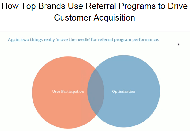
Focus on two things that really move the needle: user participation and optimization.
If you think about this as a Venn diagram, you’d really want to hit that intersection between the two. If you get many users to participate and you optimize your campaign, then 90% is covered and everything else is minutia.
User Participation: Location Matters
This means you want to encourage referrals in as many locations on your website and off your website as possible. Let’s run through four examples showing where businesses place their referral programs, as well as one using it in email campaign.
1) Prize Candle
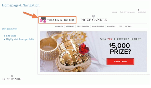
This is an example from Prize Candle. Mariotti loves that on their website, there are really only two things you can do. You can buy something or refer friends. It’s a very clean site with a low friction user flow from shopping to buying and referring. With the key location being your home page, can everyone on your website see that they can refer a friend? Even beyond the home page, the refer link is also present so people can refer friends. It’s highly visible. Anyone who studies heat maps know that the upper left portion of the page is the most valuable real estate because we read from left to right and top to bottom, so Prize Candle has done a great job putting the call out on the upper left.
2) Republic Wireless
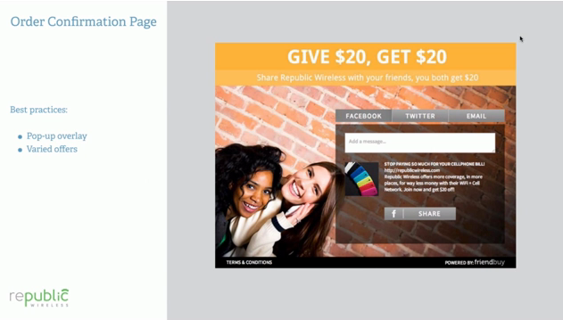
Another key location for generating referrals is the order confirmation page. This is an example from Republic Wireless:
They knew that referrals would be more cost efficient, because they don’t have the same kind of budget that their competitor Verizon would have and they really want to encourage users to get the word out about their business. This example above is a treatment from the order confirmation page.
When people ask Friendbuy about referral programs, people say that they’d really like their users to refer friends after they purchase something. A normal eCommerce website converts at about 3-5%. If you only put a post-to-purchase widget, then you’re only reaching 3-5% of your potential. It’s the farthest down the funnel. While this is a key location, it would certainly be better to include your home page and order confirmation page.
3) Dollar Shave Club
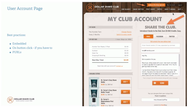
Here’s an example from Dollar Shave Club. This key location, ‘User Account’ page, is great. Every time a user logs in to check their shipment, they have the opportunity to share. In terms of best practices, it’s better to have it visible and embedded. You can trigger sharing experience from a button click, but when it’s fully open to a user, you’ll get more traction. Another thing you can consider is passing in the from email address, so users don’t have to type it. There’s a personal URL (PURL) at the bottom of the page which includes each user’s unique customer ID. There’s also a smaller arrow at the top of the page showing how they’re following best practices of having a call-out in their navigation.
4) Huckberry
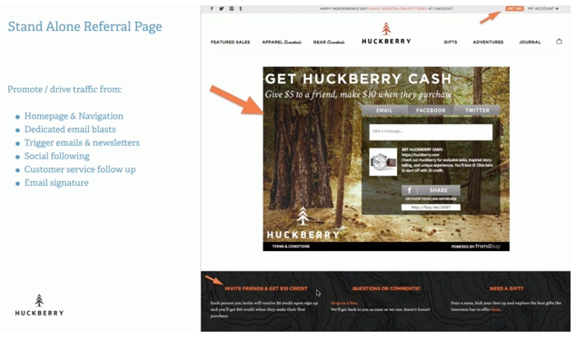
This is one of the most important locations. It’s a standalone referral page. You’ll just create some sharing experience not behind a login and on a URL that you own. In this example, it could be huckberry.com/referafriend. The key here is that when you have an open-facing referral page, you can link to it through navigation, but more importantly, you can promote. You can send dedicated email blasts to your customer base, you can include links in your trigger emails (ex. Order confirmation, shipping notifications), post this link in your newsletter, Twitter or other social media. So now, when you think about reach, going from the order confirmation page works 3-5% of your site traffic—that’s 3-5% reach. When you include ‘Get $10’ in your navigation, then that’s 100% of your site traffic. When you start sending dedicated email blasts, Tweets and Facebook posts, then you’ll have 200-300% reach. It’s drawing people in who aren’t even current customers. You can also refer friends without being customers.
5) PuraVida
Dedicated Email Blasts
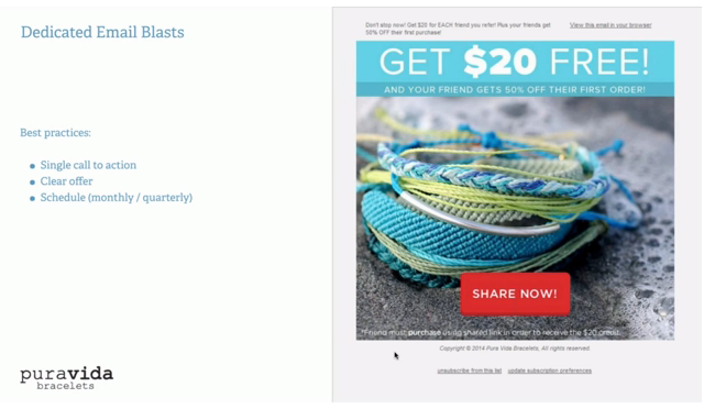
PuraVida is an example of a company that sends dedicated email blasts to their whole list, regardless if they’re customers or not. What Mariotti really likes about this email it the single call to action. There’s no extra information. It’s not a newsletter promoting several products. There’s one and only one thing you can do here.
PuraVida is pretty aggressive—they sent many email blasts and Tweets, both of which are important strategic drivers for their business.


0 comments:
Post a Comment