8 Mistakes That Could Be Absolutely Destroying Your Checkout Process
It kills me when I see a great website, a great product, and a great company completely fail in one point — the checkout process.
Marketers love to moan and complain about shopping cart abandonment rates. Yeah it hurts, especially since a full 68% of your customers will end up abandoning. But the sad thing is, we often bring it upon ourselves by having a crappy checkout process.
I’ll be the first to tell you that designing a streamlined checkout process isn’t easy. It requires a lot of clever coding, APIs, integration, architecture, and forethought. But it’s essential if you want to make sales and reduce abandonment. You must optimize your checkout process for conversions.
So, let’s talk about what those big mistakes are, and how you can avoid them.
1. Not optimizing checkout for mobile.
It’s time to pay attention to your mobile shoppers and give them some love. More shoppers than ever before are mobile, and they want to buy using their smartphones.
Tragically, many retailers have a checkout process that is absolutely terrifying to attempt on a mobile device. Ironically, it’s these same retailers that boast about their responsively designed websites. But what good is a responsive site, if you falter on the checkout process? The user can’t even buy your product!
The single most important thing you can do for your mobile shoppers is to make it easy for them to buy. A fully mobile optimized checkout process will boost your sales significantly.
2. Featuring promotional codes in your checkout process.
From the war stories of abandoned shopping carts, a common theme emerges: Users abandon a cart because they are looking for a coupon.
There’s data on this point. These statistics come from a study by PayPal and Comscore. Notice the third point down:
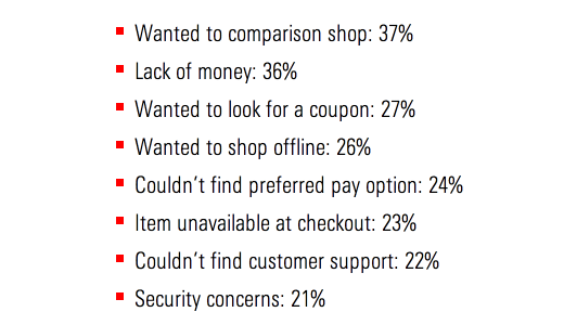
Users leave a shopping cart because they want to find a coupon.
But why would they go to find a coupon? Because the checkout process reminds them that there might be a coupon available.
This is how it works:
- The user puts something in their shopping cart and goes to checkout.
- At some point in the checkout process, they see a field asking for a “coupon code” or “discount code.”
- The user feels as if they can get a better deal if they can only find that discount code.
- They open a new tab in their browser and look for a coupon.
- They get distracted, and don’t return to their shopping cart. Or, they get frustrated because they can’t find a coupon code, and try to find the product somewhere else.
Prominently displaying a coupon field can be counterproductive to your checkout process. Rather than create trust, it does the opposite. It destroys their confidence in the price they are receiving, and encourages abandonment.
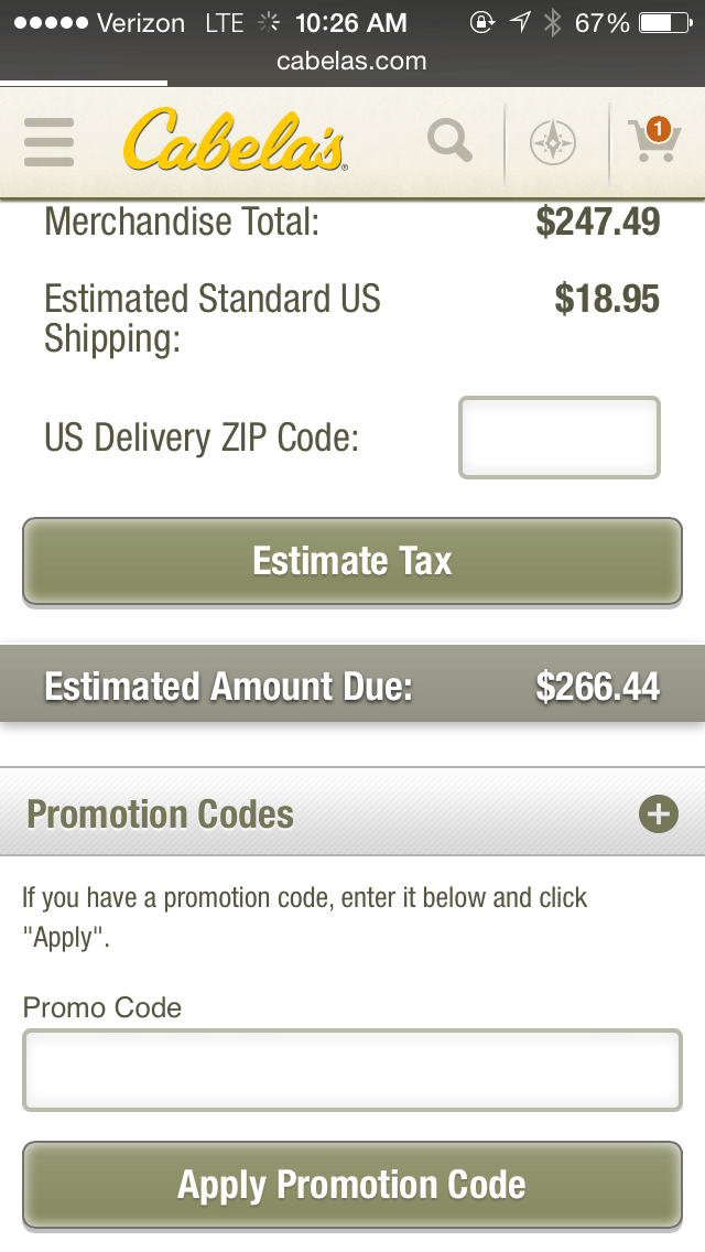
Cabela’s shopping cart asks me for a promotion code, and places this option above the checkout button. This is a signal that I might be able to find a better-priced option somewhere else.
A better way is to eliminate promotion codes altogether, or to hide the promotion code option below the checkout button or with a small text link. If a user has a promotional code, they’ll find the text link.
For more on coupon codes, you might want to read our article The One Little Box That’s Costing You Big Dollars.
3. Requiring membership or other purchase delays.
One of the worst checkout mistakes is making it a long and complicated process.
Some sites require that a shopper join before they can buy a product. Doing so will both erode trust and frustrate users, leading to shopping cart abandonment.
Most shoppers are eager to find their product and purchase it. They may not feel any loyalty to the site from which they are purchasing. They just want their goods.
Forcing them to jump through hoops in order to complete a purchase is highly counterproductive.
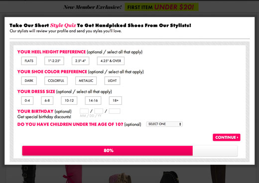
Some sites do even worse — they fence all their content to users who don’t sign up. You can’t even put an item in your shopping cart without taking a quiz or joining the site.
JustFab is an example of a site that does this. When you select a product, you are forced to take a long quiz. By this point — eight screens later — the user is only 80% of the way through the quiz. They haven’t even been able to look at a product, let alone put it in their shopping cart. Children under the age of 10? Really?
Anything that gets in the way of checking out is going to create a falloff in sales. Instead, allow users to checkout as a guest, but give them the option of becoming a member.
4. Pushing upsells.
Every retailer wants customers to buy their upsells. But some ecommerce sites do it the wrong way.
When you push upsells as separate steps in the checkout process, you will invariably infuriate your customers.
Here’s how Bluehost offers upsells. This section is part of the checkout page, and upsells are offered unobtrusively.
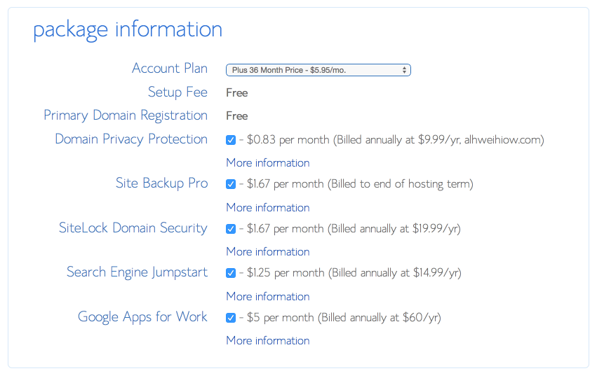
That’s the right way to offer upsells.
There’s another way, and it’s not quite as nice. In fact, it’s a huge shopping cart mistake, and it’s going to drive your customers away. Below is another hosting company, and their array of upsells.
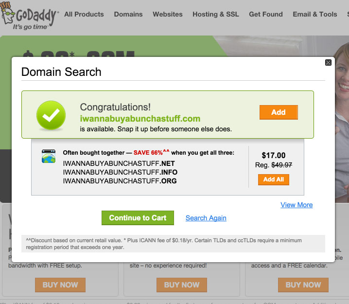
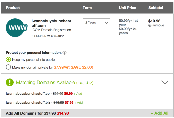


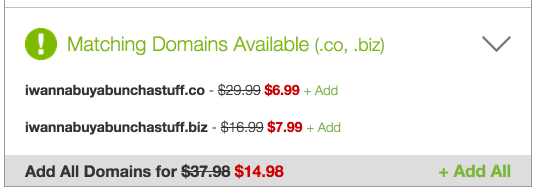
When I experimented with selecting the software service upsells, I was shocked to find that even more upsells appeared. The more upsells I selected, the more I was upsold.
By the point I was ready to check out, my total had come to $1,441.00. My intent was only to buy a domain for .99!
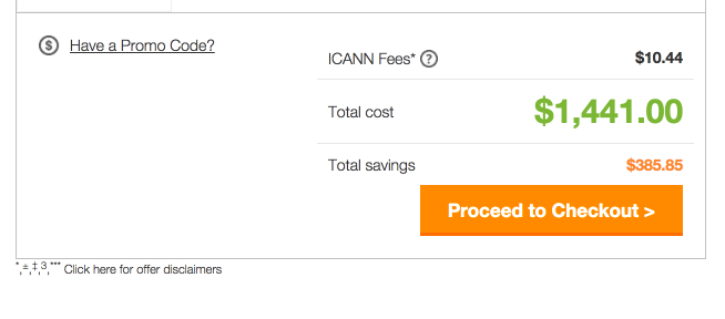
This is precisely the kind of upsells that are intrusive and off-putting — a major shopping cart mistake.
5. Tossing in extra fees.
Extra fees are another checkout process killer.
Here’s what I saw during the checkout process above.
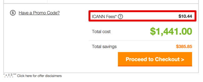
For the uninitiated, ICANN fees don’t make any sense. Why pay extra? What’s the deal? What’s ICANN?
Cabela’s commits the same fallacy. They add “estimated standard US shipping” which may create even more charges by the time I input my ZIP code. Plus, they have an “estimate tax” button, which gives me even more anxiety about extra charges.

Anytime you add extra charges, even shipping charges, you are jeopardizing the checkout process.
Users see the price that you have listed on your website. They internalize that, expect that, and are prepared to pay that. When they see charges added on, it causes them to feel cheated.
6. No trust signals.
Trust signals are crucial to any ecommerce environment.
They are important at every point in the funnel, but they become especially important at the point of sale.
When the customer has their wallet out, ready to buy, and prepared to drop some cash, they need to be assured in several ways:
- They aren’t being overcharged.
- Their payment is safe.
- They site won’t break.
- Their information won’t be compromised.
- You are a reliable business.
- They will get their product.
- They will receive confirmation.
The amount of trust needed to close a sale is almost overwhelming. However, if you strategically add trust symbols, guarantee statements, and other assurances at points during the checkout process, you’ll go a long way in securing the trust of the shopper.
7. Not providing a progress indicator.
Some of the worst checkout processes are lengthy and circuitous. We’ve all experienced these, and been infuriated at all the forms we have to fill out and the steps we have to take.
When it comes to creating a checkout process, the clearer and simpler you can be, the better.
The best way to provide clarity is to create a progress indicator. There are several ways you can do this from a design perspective — a bar, a numbered list, etc.
Whatever the case, simply let the user know where they are in the process, and how much longer it’s going to take.
8. Not providing enough payment options.
Want to open your sales up to more people? Then provide more payment options.
PayPal is the goliath in the online payment industry. If you don’t allow PayPal payments, you are losing out on a huge swath of customers. As the mobile wallet industry expands, and as online payment platforms proliferate, you’ll need to become even more flexible with payment options.
Conclusion
A lot of marketers pay close attention to the front end of their ecommerce sites — the landing pages, the home pages, the CTAs, the buttons, etc.
That’s great, and I recommend it. But don’t neglect the checkout process. This is where the rubber meets the road of ecommerce success.
kissmetrics.com


0 comments:
Post a Comment