The World's 10 Richest People

According to Forbes Magazine, the world's top 20 billionaires have a combined net worth of $899 billion. Bill Gates comes first with a massive fortune of $79 billion. Even though he stepped down as Microsoft's CEO in 2000, he has topped the rankings for 16 of the last 21 years. 

When it comes to the world's top 10 richest individuals, seven are American. The three exceptions are second placed Carlos Slim Helu and his family from Mexico, worth $77 billion, fourth placed Amancio Ortega of Spain who is worth $64.5 billion and tenth placed Liliane Bettencourt of France who has a wealth of $40 billion.

Infographic: The World's 10 Richest People | Statista
You will find more statistics at Statista

Introduction to Conjoint Analysis

Conjoint analysis is a market research tool for developing effective product design.
Using conjoint analysis, the researcher can answer questions such as: What product
attributes are important or unimportant to the consumer? What levels of product
attributes are the most or least desirable in the consumer’s mind? What is the market
share of preference for leading competitors’ products versus our existing or proposed
product?
The virtue of conjoint analysis is that it asks the respondent to make choices in the
same fashion as the consumer presumably does—by trading off features, one against
another.

For example, suppose that you want to book an airline flight. You have the choice of
sitting in a cramped seat or a spacious seat. If this were the only consideration, your
choice would be clear. You would probably prefer a spacious seat. Or suppose you
have a choice of ticket prices: $225 or $800. On price alone, taking nothing else into
consideration, the lower price would be preferable. Finally, suppose you can take
either a direct flight, which takes two hours, or a flight with one layover, which takes
five hours. Most people would choose the direct flight.

The drawback to the above approach is that choice alternatives are presented on
single attributes alone, one at a time. Conjoint analysis presents choice alternatives
between products defined by sets of attributes. This is illustrated by the following
choice: would you prefer a flight that is cramped, costs $225, and has one layover, or a
flight that is spacious, costs $800, and is direct? If comfort, price, and duration are the
relevant attributes, there are potentially eight products:

Product  Comfort  Price  Duration
1 cramped $225 2 hours
2 cramped $225 5 hours
3 cramped $800  2 hours
4 cramped $800  5 hours
5 spacious $225 2 hours
6 spacious $225 5 hours
7 spacious $800  2 hours
8 spacious $800  5 hours

Given the above alternatives, product 4 is probably the least preferred, while product 5
is probably the most preferred. The preferences of respondents for the other product
offerings are implicitly determined by what is important to the respondent.
Using conjoint analysis, you can determine both the relative importance of each
attribute as well as which levels of each attribute are most preferred. If the most
preferable product is not feasible for some reason, such as cost, you would know the
next most preferred alternative. If you have other information on the respondents, such
as background demographics, you might be able to identify market segments for which
distinct products can be packaged. For example, the business traveler and the student
traveler might have different preferences that could be met by distinct product offerings.


,

The A-Z Guide to Conversion Rate Optimization (Poster)

Conversion Rate Optimization (CRO) is one of the most important aspects of building a successful e-commerce and lead generation website.
Conversion optimization gets you more money with the same traffic. What’s not to like?
However, if your website exists but people do not convert or buy, you could be losing thousands of dollars per day to your competition.
Do you want to lose thousands of dollars per day?
I didn’t think so.
So how can you get started with conversion optimization?
I’ve created this infographic to provide you specific improvements that have helped me increase conversion rates for every single site I’ve worked with, which in turn has helped my clients increase online sales by more than $300 million dollars.
This A to Z guide to Conversion Rate Optimization infographic provides you with 26 specific improvements that will help you improve user experience, conversion rate and your online sales.
The A to Z Guide to Conversion Rate Optimization Infographic
, , ,

5 Easy Google Analytics Reports to Help You Increase Conversions

Google Analytics is a powerful ally in boosting your conversion rate. A lot of conversion rate optimization strategies begin with user testing and serving variations of the same web page to a relatively small subset of visitors. That’s like a doctor prescribing medicine before making a diagnosis.
You need to find the problems that are affecting your conversion rate first before you start trying to change things. The vast amount of analytics data at your fingertips can help you discover obvious conversion issues, many of which can be quickly resolved.
Before you bang your head against a wall trying to figure out the sources of your conversion woes, load up these five reports to get easy answers.
Each section contains a link to a Google Analytics custom report. Apply it to your view and follow along.

1. Keep Up with the Screens

With desktops, laptops, smartphones, tablets, and now the newly dubbed “phablets,” people are accessing your website on a variety of devices with different screen resolutions. It helps to have a responsive website that will adjust to these different devices, but if you’re not monitoring the data, then you are not seeing where your site design is failing.
Goal: To find screen resolutions at which your responsive or mobile site design is providing a poor user experience.
On the surface, this report looks a lot like the one found at Audience > Mobile > Overview. However, this one will allow you to drill into each device category to see data corresponding to screen resolution and device information (mobile devices only). Follow these steps:

1. Apply the custom report

1 device category

2. Look at the category-level metrics

Decide which device category you want to drill into further. In the example above, conversion rates are significantly lower for mobile phones.
2 screen resolution report

3. Look at the most common screen resolutions for that device category

Try to identify which dimensions correspond with lower-than-average behavior metrics and conversion rate. It’s 320×480 in the example above.
If you click on a screen resolution, you’re given the device brand and model for devices that accessed your site with those dimensions. In this case, the culprit was a first generation iPhone.
Once you know the screen resolutions and devices that your website design is failing on, you can do a few things to troubleshoot the underlying issues. The best solution is to access your website using the devices you’ve identified. However, you might not have an older generation iPhone just lying around. In that case, you have a few other options:
  • For responsive websites, a simple solution is to resize your desktop browser to the appropriate screen resolution. For Chrome, you can install the free Window Resizer plugin to quickly snap your browser to the desired dimensions. Similarly, for Firefox, you can try out Responsive Design Mode.
  • Plug your website into a browser-based emulator like Screenfly. It will display your website based on sizes of popular devices, or you can set your own custom dimensions. You can easily switch between landscape and portrait modes with this option.
So, find out why your website design is breaking, have a front-end developer fix it, and you’ll have plugged up this conversion leak.

2. Know When Your Visitors Are Converting

Do you convert more visitors during the week or on weekends? Business hours or after work? Knowing when your visitors convert can have important implications for site messaging, social media marketing, and online advertising campaigns.
Goal: To learn when users are most likely to convert.
Then, follow these steps:

1. Apply the custom report

3 goal completions

2. You’ll get a very helpful graph showing your website’s goal completions by hour

Hours are based on the 24-hour clock. The graph above shows goal completions peaking between 9:00 a.m. and 2:00 p.m. Note: the time zone is based on your settings under Admin > View Settings.
4 primary dimension hour

3. Connect the time of goal completions with the day of the week

For this, we want to build a pivot table. Select the pivot icon at the top right-hand corner of the table. Change the “Pivot by” dropdown to “Day of Week Name.”
5 goal completions hourly

4. The table you’ll end up with organizes goal completions by the hour and day of the week

Find when your users are most and least likely to convert.
Understanding when your users are more likely to convert can be helpful in many of your online marketing initiatives. For example, the users represented in the table above convert most often on Thursdays over lunch. However, they’re much less likely to convert on Tuesdays at the same time. In this scenario, changing the messaging or a CTA on Thursday to reference a lunch break would resonate well with your audience at that time.
Similar lessons can be applied to time your social media posts, email newsletters, PPC ads, and blog posts to get in front of your audience when they’re most likely to convert.

3. Monitor Your Site Performance

Your site is losing money with every second that ticks by. So much of conversion rate optimization focuses on design and messaging, but your visitors may be bouncing before they even get that far.
Goal: To identify slow-loading sections of your website that are causing your conversion rate to suffer.
There are a few metrics available in Google Analytics to measure page speed. We’ll focus on Average Document Interactive Time. This is the average time (in seconds) that it takes for a page to be rendered so that a user can interact with it. Follow these steps:

1. Apply the custom report

6 avg doc interact time

2. Look at with the “Comparison” view

It is found at the upper right-hand side of the table. Select “Avg. Document Interactive Time” from the dropdown menu to compare load times of your most viewed pages against the site average. You’ll be able to pick out your poor performing pages.
7 page path level

3. Find slow-loading web pages

Then, use the dropdown to see if load time correlates with poor behavior metrics or a poor conversion rate. Above, we see that this site’s homepage and blog are very slow. These are the two areas of the site that new visitors enter through most often, and therefore, are important to the top of the conversion funnel.
Using some free online tools, we can quickly figure out why these pages are lagging behind the site average. My favorite is the Pingdom Website Speed Test. It provides an analysis of the page so that you can figure out what’s causing the slowness, whether it’s scripts, images, or another issue.
Speeding up key areas of your site will free up clogs in your conversion funnel and allow your users to move quickly through their desired actions.

4. Find Low-Converting “Keywords”

We’re all well aware that organic keyword data is no longer provided by Google Analytics. This does not mean, however, that you can’t get key insights into how your web pages perform in organic search results.
There are a number of ways to unlock keyword data in Google Analytics, and this report will help you focus your keyword targeting.
Goal: To optimize your website’s landing pages for high-converting search terms.
If you’re paying attention to your site’s SEO, you’re probably optimizing your page titles to target relevant keywords. This report shows the performance of your website’s landing pages, filtering for organic search traffic, split by page title (or target keywords). Essentially, we’re A/B split testing our page titles here. Follow these steps:

1. Apply the custom report

8 organic searches bounce rate

2. You’ll see your site’s landing pages ordered by organic searches

As a secondary dimension, you’ll see page titles associated with those landing pages and other pages that users visited while on your site. It’s a good idea to expand the date range for this report, especially if you’ve refreshed your page titles recently.
9 landing page keyword variation

3. Use the search box or the advanced filtering to search URLs or keywords

In the example above, the page title on a single landing page was changed to target a longer-tail keyword. This change corresponded with a 200% increase in the page’s conversion rate.
10 site messages

4. You can take this report one step further by going to your Google Webmaster Tools account

Once logged in, click Search Traffic > Search Queries, and change the tab at the top to “Top pages.”
11 landing page screenshot

5. Find your landing page in the table

If there is keyword data associated with that page, you will see an arrow to the left of the URL. Click this arrow and see how your keywords are performing. Above, you can see that the Variation B keyword from the page title is driving high-quality clicks to the page.
After auditing a few of your top landing pages with this report, you’ll start to uncover commonalities among the high-converting keywords. Perhaps they’re location-specific or include sales qualifiers. Apply these lessons to your low-converting landing pages, and use this report to test the results.

5. Check Your Visitor Behavior by Browser Type

Most people pick their preferred browser and stick with it. When is the last time you audited your website with Internet Explorer or Safari? It’s very common to overlook compatibility issues with your site’s code and how it renders on popular browsers.
Goal: To identify technical and UX issues that are specific to a browser type.
Thanks to Craig Sullivan of Optimal Visit for sharing his favorite analytics report.
Follow these steps:

1. Apply the custom report

12 broswer versions

2. Check the behavior metrics and conversion rates for the various browsers and versions

The website above, for example, is clearly having issues with Safari.

3. Apply advanced segments for desktop, mobile, and tablet devices

If you’ve identified cross-browser compatibility issues, your next step is to view your site on the affected browser. However, if you have a different browser version installed or the specific browser in question is limited to a device you don’t own, you might want to invest in a tool like BrowserStack.

Conclusion

Most of the issues you’ll find with these five analytics reports will have a simple fix. You just need to find the problem. Watch these reports on a regular basis, take action, and you’ll see an immediate improvement in your site’s ability to convert visitors.
, ,

The Must-Have Mobile App Metrics Your Business Cannot Do Without

The Must-Have Mobile App Metrics Your Business Cannot Do Without

This article is a summary of the AppInTop mobile app marketing podcast in which AppInTop talked with CTO and co-founder of the mobile analytics companyAdjust.com, Paul Müller, and senior account strategist at Google, Stanislav Vidyaev. This summary covers some key facts about mobile analytics.
The way people interact with an app is different from the way they use websites. Mobile app analytics is about converting ad budgets to installs, and installs to repeated app usage and in-app purchases. Ultimately, the objective of a mobile app developer is to evaluate user lifetime value, retention, and the frequency of usage.

First, A Recap on the Importance of Mobile

how mobile is changing business

Getting Your Foothold in an App Store

Running a mobile app as a business is essentially about balancing the cost of user acquisition with the user lifetime value, which is how much money the user will spend on the app throughout the time he or she uses it.
As user acquisition costs grow rapidly, optimizing that cost is as important as improving the user lifetime value. Getting the app up into the top ranks of the app stores becomes the name of the game for most of the major app publishers, because that is where the free, organic users find the app.
What gets an app into the top ranks varies slightly between the App Store and Google Play, but the most important factors are:
  • The number of installs in the first 72 hours of the app’s launch (and thereafter)
  • The number and quality of reviews and ratings
  • User retention (Google Play)
The beginning of an app’s life in the app stores will determine where it will rank in the long run. So, use services such as App Annie to track your key app store statistics.

Tracking Installs

Daily installs and their sources are the basic metrics a developer needs to track. No installs means no users, and no users means no revenue.
Understanding the sources of these installs is equally important. This is how marketers evaluate the effectiveness of their advertising channels.
Working with an independent tracker is essential in order to eliminate a conflict of interest that comes, for example, with using a tracking solution from an ad network. A tracker offered by an ad network, whose sole interest is to sell you as many installs as possible, may leave you wondering if your reported installs reflect the actual picture.
Which tracker to use?
Tracking services from companies independent from ad networks would not have a conflict of interest. Look at AppsFlyerMAT by HasOffersAdjust.com, or Google Mobile App Analytics.

Retention and Usage

The retention metric is based on the frequency of app sessions. Many mobile analytics platforms routinely record the number of sessions, without giving too much thought to what a session actually is. They define a “session” the same way iOS rules do, which is the act of a user opening the app.
This is not a good definition, as a user may be distracted from the app by push notifications, messages, and phone calls. Google Analytics counts only sessions that have 30 minutes between them, which is a more acceptable definition.
The “retention” metric is calculated by dividing the number of users who return to the app daily by the total number of users from the group monitored.
The “churn rate” is the opposite of retention. It is the percentage of users who do not return to the app.
The retention metric is important to evaluate the user lifetime, which in turn, is used to calculate the lifetime value of the user.
The “user lifetime” (LT) is the average number of days a user from the original group spent in total interacting with the app. This metric helps evaluate how many users the app should acquire daily in order to maintain or grow revenue.
The other usage metrics serve to help app developers identify the popularity of different sections within the app and improve the user experience. This set of metrics is essential to understand what is actually happening in the app.

Break-even Metrics

The app, the main purpose of which is to generate revenue, will need to be measured based on the user lifetime value.
The “user lifetime value” (LTV) is calculated based on the revenue the user generates over their lifetime. This is purely a marketing metric to calculate return on investment in marketing and advertising.
The “average revenue per user” (ARPU) is calculated by dividing the total revenue per user by the user lifetime.
The “virality” metric or K-factor is essential because it helps lower the cost of user acquisition. If your user tells another user about your app, then your cost is no longer $2 per user, but $1 per user or even less. It is a complex metric that can be calculated in a number of ways and takes into account the number of users who came from viral channels as well as the number of daily active users (DAU), user lifetime (LT), and new users.
If an app asks users to share links on social media, those links and the new users who come from those links can be tracked to calculate the virality metric.
“Cost of user acquisition” is required to build a business case for an app. This is the cost of all marketing efforts divided by the total number of installations over a fixed period of time. If the cost of user acquisition is less than the LTV, the app will be profitable.

Cohort Analysis

The purpose of cohort analysis is to tell you which channel works best: Facebook,InMobi native adsAarki interactive adsUnity video ads, or any other ad sources you are using. For example, in launching Wooga’s game Jelly Splash, the company used 23 ad networks to get it in the top charts of the key markets, according to Wooga’s head of marketing, Eric Seufert.
Cohort analysis is all about grouping users into segments and analyzing the metrics of those groups. Cohorts are based on traffic source, country, and device.
Identifying more profitable cohorts helps better target users with ads to increase user lifetime value and app revenue. The key metric is the total revenue generated by the cohort divided by the number of users in that cohort.

Measuring the Effectiveness of TV Ads

Measuring the impact of TV ads on mobile app installs has not yet been openly offered by mobile analytics companies, although Adjust.com is running a closed beta TV ad tracking service. The results of the early tests have shown that there is indeed a correlation between a number of organic installs and the TV ad.
This metric is calculated by comparing the number of organic installs received 5 minutes before the TV ad is shown with the number of installs during and a short time after the TV ad is shown. The number of installs that came from the TV ad is the difference between those two measurements.

Custom Metrics

App developers may have very specific requirements about which metrics to track for increasing retention rate, optimizing user experience, or improving monetization.
Analytics services may not be able to offer ready-to-use metrics in their dashboard, but there is always an option to set up custom variables for creating custom reports. Using those custom reports (for example, Google Mobile App Analytics) enables app developers to tag the paying user in an app, segment the paying users, and then analyze them separately.
The challenge of collecting and analyzing the app metrics is the technical implementation that requires a developer to work alongside the marketer. One solution is to implement the SDK of an existing analytics company that has an extensive list of predefined metrics. A detailed analysis of various analytics services will be the topic of a future article.

The Future of Mobile App Analytics

For businesses where both mobile and web presence are equally important (for example, ecommerce), division between mobile and web may not be as strong as in, say, mobile-first businesses that track a completely different set of metrics. Google’s introduction of Universal Analytics aims to help such businesses analyze their users, regardless of whether they interact with the company’s brand online or on a mobile device.
There is a trend to move from a fragmented analytics service landscape to a single source of app data. The industry is likely to adopt a platform model, where a single source for data will be used by various specialized providers, but that single platform will provide a bigger picture to app developers about what is happening with the app and in the app.

kissmetrics.com
, , ,

How These Five Companies Use Referral Programs to Drive Customer Acquisition

No matter what vertical or category your business falls into, referral programs have been proven to work for all types and size companies. But knowing how to do referral programs well is another story.
In this webinar, Friendbuy COO Tony Mariotti draws from his experience of running thousands of referral campaigns. He’s been in the sales and marketing trenches since the ‘dot com’ boom and bust of the late 90s.
Friendbuy is a customer referral platform, where marketers can set up customer referral campaigns and measure performance.
Note: This webinar is geared for people who sell something. When you think about collaboration products like Yammer, invitations are almost vital for the collaboration necessary for the tool. You invite your coworkers and the product is useless without other people using it. If you look at freemium models like Dropbox, they ask users to upgrade and ask cohorts to sign up to see if you can make money down the line. Studying these companies is useful, but this webinar is geared more towards eCommerce and how you can make the sale today.

How do I get more referrals?

Focus on two things that really move the needle: user participation and optimization.
venndiagram
If you think about this as a Venn diagram, you’d really want to hit that intersection between the two. If you get many users to participate and you optimize your campaign, then 90% is covered and everything else is minutia.

User Participation: Location Matters

This means you want to encourage referrals in as many locations on your website and off your website as possible. Let’s run through four examples showing where businesses place their referral programs, as well as one using it in email campaign.

1) Prize Candle

prizecandle
This is an example from Prize Candle. Mariotti loves that on their website, there are really only two things you can do. You can buy something or refer friends. It’s a very clean site with a low friction user flow from shopping to buying and referring. With the key location being your home page, can everyone on your website see that they can refer a friend? Even beyond the home page, the refer link is also present so people can refer friends. It’s highly visible. Anyone who studies heat maps know that the upper left portion of the page is the most valuable real estate because we read from left to right and top to bottom, so Prize Candle has done a great job putting the call out on the upper left.

2) Republic Wireless

Another key location for generating referrals is the order confirmation page. This is an example from Republic Wireless:
republic
They knew that referrals would be more cost efficient, because they don’t have the same kind of budget that their competitor Verizon would have and they really want to encourage users to get the word out about their business. This example above is a treatment from the order confirmation page.
When people ask Friendbuy about referral programs, people say that they’d really like their users to refer friends after they purchase something. A normal eCommerce website converts at about 3-5%. If you only put a post-to-purchase widget, then you’re only reaching 3-5% of your potential. It’s the farthest down the funnel. While this is a key location, it would certainly be better to include your home page and order confirmation page.

3) Dollar Shave Club

dollarshaveclub
Here’s an example from Dollar Shave Club. This key location, ‘User Account’ page, is great. Every time a user logs in to check their shipment, they have the opportunity to share. In terms of best practices, it’s better to have it visible and embedded. You can trigger sharing experience from a button click, but when it’s fully open to a user, you’ll get more traction. Another thing you can consider is passing in the from email address, so users don’t have to type it. There’s a personal URL (PURL) at the bottom of the page which includes each user’s unique customer ID. There’s also a smaller arrow at the top of the page showing how they’re following best practices of having a call-out in their navigation.

4) Huckberry

huckberry
This is one of the most important locations. It’s a standalone referral page. You’ll just create some sharing experience not behind a login and on a URL that you own. In this example, it could be huckberry.com/referafriend. The key here is that when you have an open-facing referral page, you can link to it through navigation, but more importantly, you can promote. You can send dedicated email blasts to your customer base, you can include links in your trigger emails (ex. Order confirmation, shipping notifications), post this link in your newsletter, Twitter or other social media. So now, when you think about reach, going from the order confirmation page works 3-5% of your site traffic—that’s 3-5% reach. When you include ‘Get $10’ in your navigation, then that’s 100% of your site traffic. When you start sending dedicated email blasts, Tweets and Facebook posts, then you’ll have 200-300% reach. It’s drawing people in who aren’t even current customers. You can also refer friends without being customers.

5) PuraVida

Dedicated Email Blasts
puravida
PuraVida is an example of a company that sends dedicated email blasts to their whole list, regardless if they’re customers or not. What Mariotti really likes about this email it the single call to action. There’s no extra information. It’s not a newsletter promoting several products. There’s one and only one thing you can do here.
PuraVida is pretty aggressive—they sent many email blasts and Tweets, both of which are important strategic drivers for their business.


kissmetrics.com

, , ,

How A/B Testing Works (for Non-Mathematicians)

A/B testing is a great way to determine which variation of a marketing message will improve conversion rates (and therefore likely improve sales and revenue).
Many of you use A/B testing already, but you may need some help understanding what all the results mean. My goal here is to explain the numbers associated with A/B testing without getting bogged down in mathematical equations and technical explanations.
A/B testing results are usually given in fancy mathematical and statistical terms, but the meanings behind the numbers are actually quite simple. Understanding the core concepts is the important part. Let the calculators and software do the rest!

Sampling and Statistical Significance

The first concept to discuss is sampling and sample size. Determining whether the results from a set of tests are useful is highly dependent on the number of tests performed. The measurement of conversion from each A/B test is a sample, and the act of collecting these measurements is called sampling.
fries vs. onion rings
Let’s suppose you own a fast food restaurant and would like to know if people prefer French fries or onion rings. (If you are already in business, you probably know the answer from sales of each.) Let’s pretend you are not in business yet and want to estimate which will sell more, so you can pre-order your stock of each accordingly.
Now, suppose you conduct a survey of random people in the town where the restaurant will be located, and you ask them which they prefer. If you ask only three people total, and two say they like onion rings better, would you feel confident that two-thirds of all customers will prefer onion rings, and then order inventory proportionately? Probably not.
As you collect more measurements (or samples, and in this case, ask more people), statistically the results stabilize and get closer to representing the results you will actually see in practice. This applies just as much to website and marketing strategy changes as it does to French fries and onion rings.
The goal is to make sure you collect enough data points to confidently make predictions or changes based on the results. While the math behind determining the appropriate number of samples required for significance is a bit technical, there are many calculators and software applications available to help. For example, evanmiller.org has a free tool you can start using right now:
evans sample size calculator

Confidence Intervals

It is likely that you have seen a confidence interval, which is a measure of thereliability of an estimate, typically written in the following form: 20.0% ± 2.0%.
Let’s suppose you performed the French fries-versus-onion-rings survey with an adequate number of people to insure statistical significance, which you determined by using your trusty statistical calculator or software tool. (Note that the sample population (demographics, etc.) matters as well, but we will omit that discussion for simplicity.)
Let’s say the results indicated 20% of those surveyed preferred onion rings. Now, notice the ± 2.0% part of the confidence interval. This indicates the upper and lower bounds of the people who prefer onion rings, and is called the margin of error. It is actually a measurement of the deviation from the true average over multiple repeated experiments.
Going back to the 2% margin of error, subtracting 2% from 20% gives us 18%. Adding 2% to 20% gives us 22%. Therefore, we can confidently conclude that between 18-22% of people prefer onion rings. The smaller the margin of error, the more confident we can be in our estimation of the average result.
Assuming a good sample population and size, this basically tells us we can confidently assume that if we were somehow able to survey, for example, everyone in the United States, 95% of the survey answers received in favor of onion rings would lie somewhere between 18-22%. In other words, we can be relatively certain that 18-22% of the people in the U.S. prefer onion rings over French fries.
Therefore, if we are placing an order to stock our restaurant, we may want to make sure that 22% of our onion rings-and-French-fries inventory is onion rings, and the rest is French fries (i.e., 78%). Then, it would be very unlikely we would run out of either, assuming the total stock is enough for the amount of time between orders.

Confidence Intervals in A/B Testing

Applying this to the A/B testing of a website change would lead to the same type of conclusion, although we would need to compare the confidence intervals from both test A and test B in order to come to a meaningful conclusion about the results.
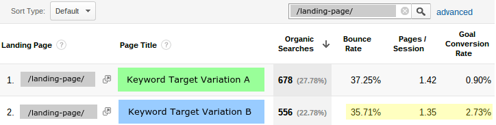
So, now, let’s suppose we put a fancy new “Buy Now” button on our web page and are hopeful it will lead to increased conversions. We run A/B tests using our current button as the control and our fancy new button as the test variation.
After running the numbers through our A/B testing software, we are told the confidence intervals are 10.0% ± 1.5% for our control variation (test A) and 20.0% ± 2.5% for our test variation (test B).
Expressing each of these as a range tells us it is extremely likely that 8.5-11.5% of the visitors to our control version of the web page will convert, while 17.5-22.5% of the visitors to our test variation page will convert. Even though each confidence interval is now viewed as a range, clearly there is no overlap of the two ranges.
Our fancy new “Buy Now” button seems to have increased our conversion rate significantly! Again, assuming an appropriate sampling population and sample size, we can be very confident at this point that our new button will increase our conversion rate.

How Big Is the Difference?

In the example above, the difference was an obvious improvement, but by how much? Let’s forget about the margin of error portion of the confidence interval for a minute and just look at the average conversion percentage for each test.
Test A showed a 10% conversion rate and test B showed a 20% conversion rate. Doing a simple subtraction (i.e., 20% – 10% = 10%) indicates a 10% increase in conversion rate for the test variation.
A 10% increase seems like a really great improvement, but it is misleading since we are looking at only the absolute difference between the two rates. What we really need to look at is the difference between the two rates compared with the control variation rate.
We know the difference between the two rates is 10% and the control variation rate is 10%, so if we take the ratio (i.e., divide the difference between the two rates by the control variation rate), we have 10% / 10% = 1.0 = 100%, and we realize this was a 100% improvement.
In other words, we increased our conversions with our new button by 100%, which effectively means that we doubled them! Wow! We must really know what we’re doing, and that was quite an awesome button we added!
Realistically, we may see something more like the following. Test A’s confidence interval is 13.84 ± 0.22% and test B’s is 15.02 ± 0.27%. Doing the same sort of comparison gives us 15.02% – 13.84% = 1.18%. This is the percentage increase in conversions for the test variation.
Now, looking at the ratio, 1.18% / 13.84% = 8.5%, indicates we increased our conversions by 8.5% despite the fact that the absolute percentage increase was only 1.18%. This is therefore a pretty significant improvement. Wouldn’t you be happy to increase your conversions by almost ten percent? I would!
It is worth keeping in mind that percentages are usually better indicators of changes than absolute values. Saying the conversion rate increased by 8.5% sounds a lot better, and is more meaningful, than saying it was a 1.18% absolute increase in conversions.

Overlap of Confidence Intervals

One thing to watch out for is overlap of the confidence intervals from the A and B tests. Suppose that test A has a confidence interval of 10-20% for conversion rates, and test B has a confidence interval of 15-25%. (These numbers are obviously contrived to keep things simple.)
Notice that the overlap of the two confidence intervals is 5%, and it is located in the range between 15-20%. Given this information, it is very difficult to be sure the variation tested in B is actually a significant improvement.
Explaining this further, usually a 5% overlap between A/B confidence intervals indicates that either the variations are not statistically significant or that not enough measurements (i.e., samples) were taken.
If you feel confident that enough samples were collected based on your trusty calculator to determine sample size, then you may want to rethink your variation test and try something else that could have a bigger impact on conversion rates. Ideally, and preferably, you can find variations that result in conversion rate confidence intervals that do not overlap with the control test.

Summary

A/B testing is a technique certainly based on statistical methods and analysis. That said, you do not need to be a statistician to understand the concepts involved or the results given to you by your favorite A/B testing framework.
Sure, you could learn the mathematical equations used to calculate statistics and metrics surrounding your test, but in the end, you are likely much more concerned with what the results mean to you and how they can guide you to make targeted changes in your marketing or product.
We have discussed a variety of concepts and statistical terms associated with A/B testing, and some of the resulting quantities that can be used to make decisions. Understanding the concepts presented here is the first step toward making great decisions based on A/B testing results. The next step is ensuring that the tests are carried out properly and with enough sampling to provide results you can have confidence in when making important decisions.

Online Tools and Resources

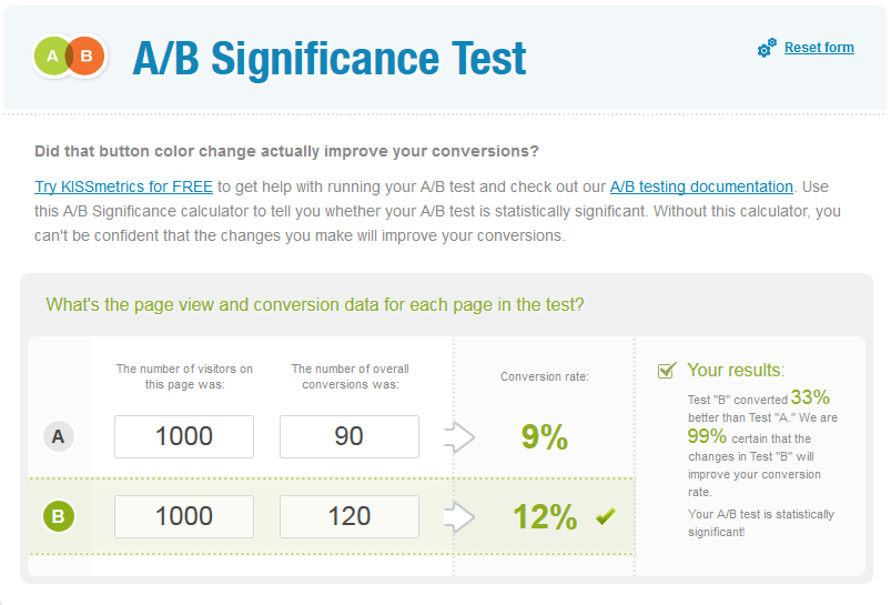
Here are some links to tools that will help you with your A/B tests. The image below is a link to an A/B Significance Test Calculator located ongetdatadriven.com.
A B significance test
kissmetrics.com
Menu :